Phase · I
Look
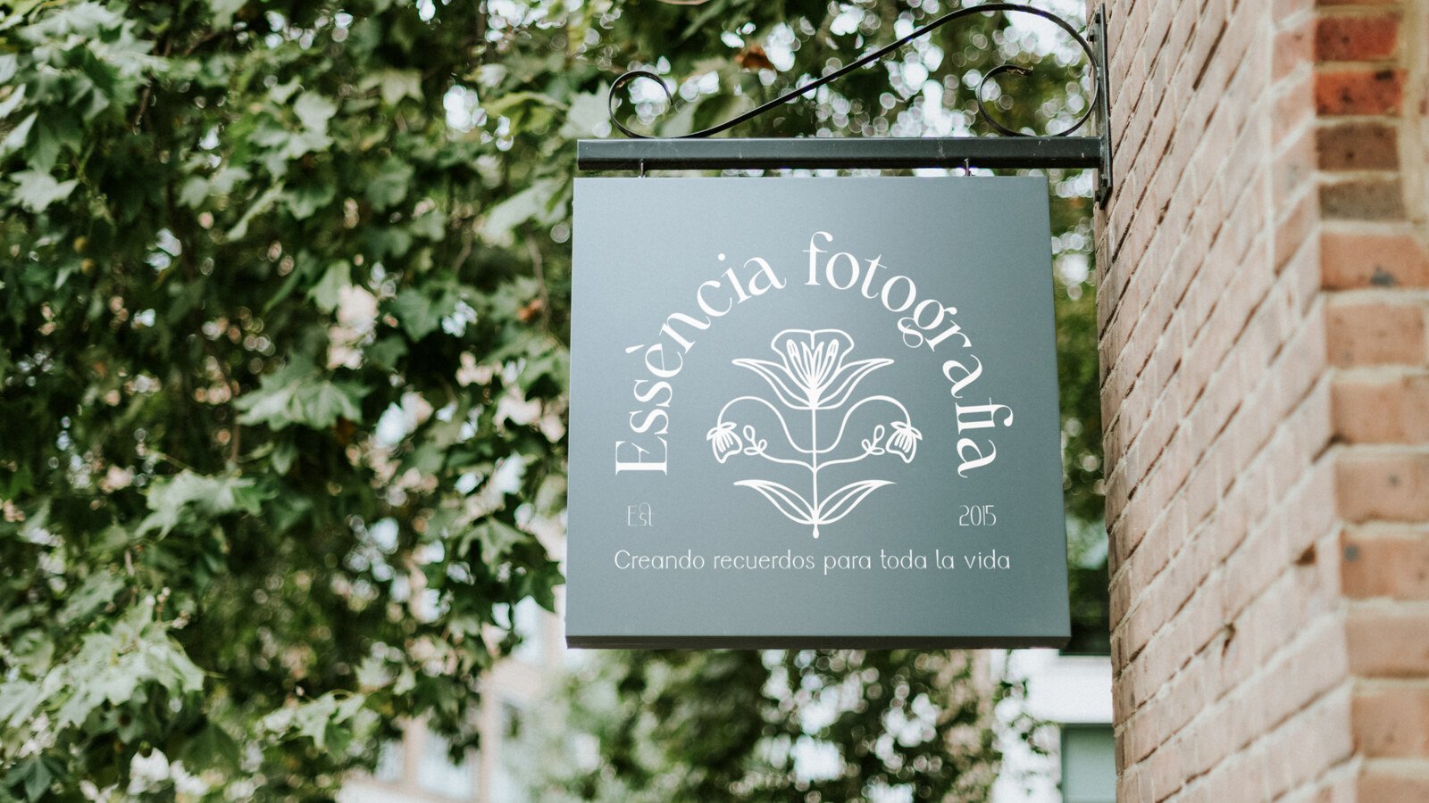
We read the brand from outside the noise: what it says, what isn’t understood, what contradicts itself and what is blocking its clarity. Before you design, you have to look properly.
Everything that already exists gets reviewed: the logo, the social accounts, the website, the space, the packaging, how a message gets answered. A brand isn’t what the guidelines say: it’s what somebody arriving for the first time perceives.
Before you design, you have to look properly.
Phase · II
Spot
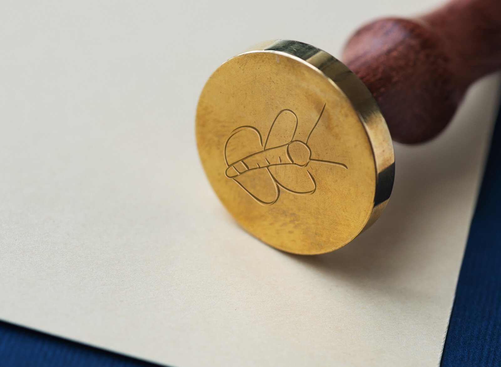
This is where divergent thinking shows up: invisible connections, repeated messages, visual contradictions and openings nobody has used. Where others see loose pieces, we look for patterns.
The pattern is almost never invented. It’s usually already there, in how the client talks about their own business when they forget they’re selling it.
Where others see loose pieces, DÍVERA looks for patterns.
Phase · III
Structure
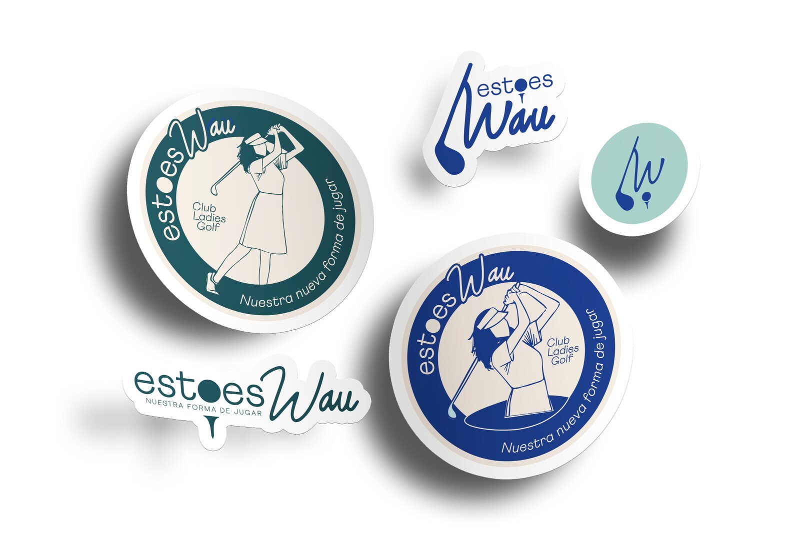
We turn what’s scattered into direction: brand focus, visual territory, key messages, tone, hierarchies and priorities. It isn’t about adding more: it’s about understanding what holds it all together.
This phase is written down and signed off before the design software is opened. It’s what lets us justify every visual decision afterwards without falling back on taste.
It isn’t about adding more. It’s about understanding what holds it all together.
Phase · IV
Shape
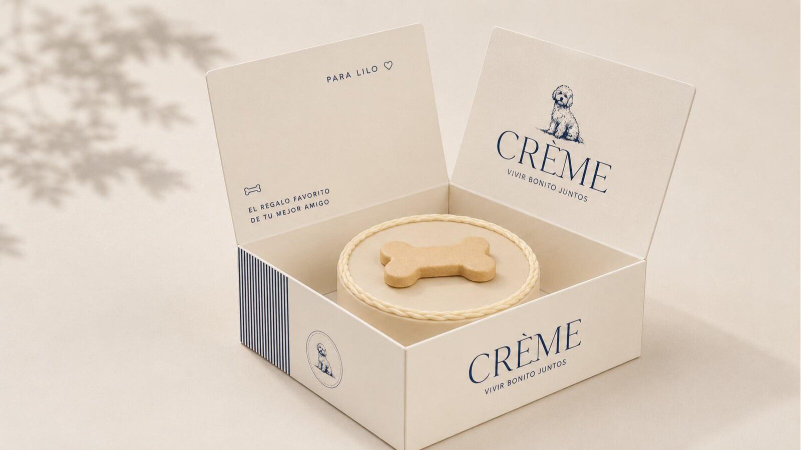
Clarity becomes visible when it takes shape: identity, website, packaging, space, content, presentations and every point of contact with your customer.
And it’s handed over so you can carry on without us: guidelines, editable files, templates and print-ready artwork.
Clarity becomes visible when it takes shape.
Where you can see it
The same method, four different brands
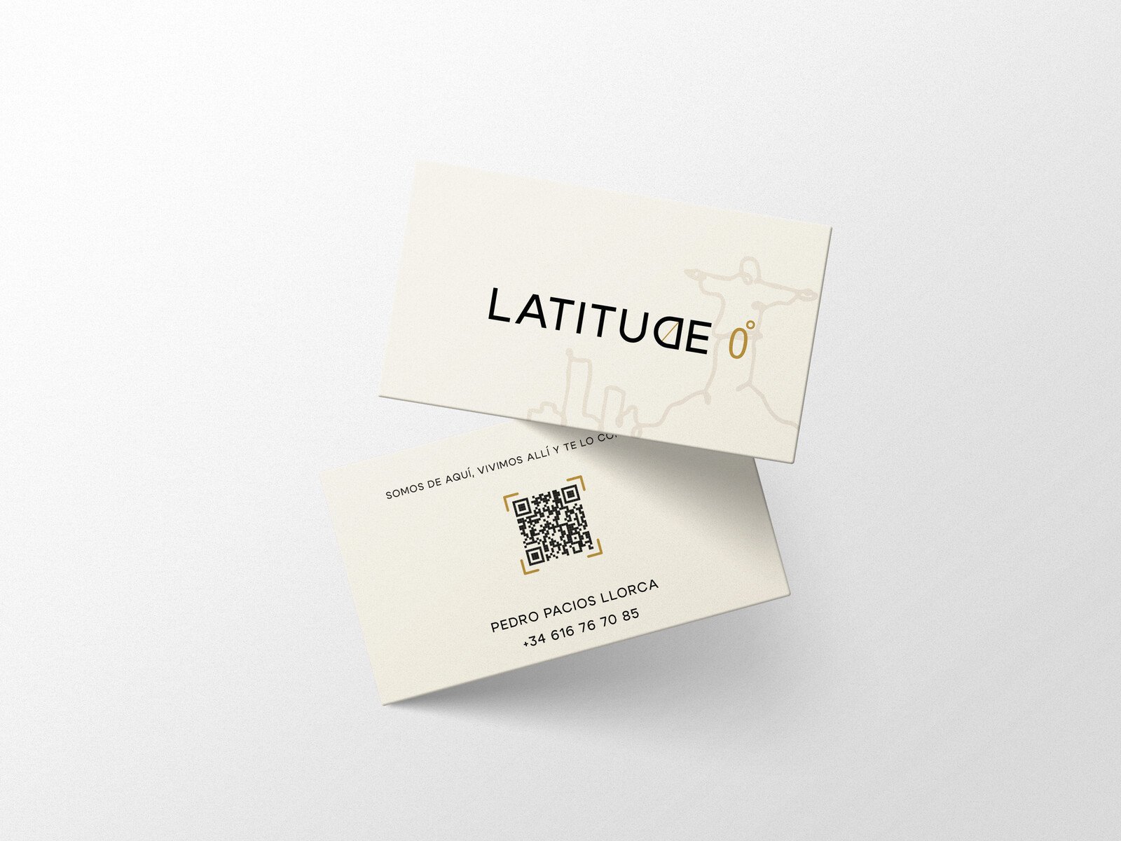
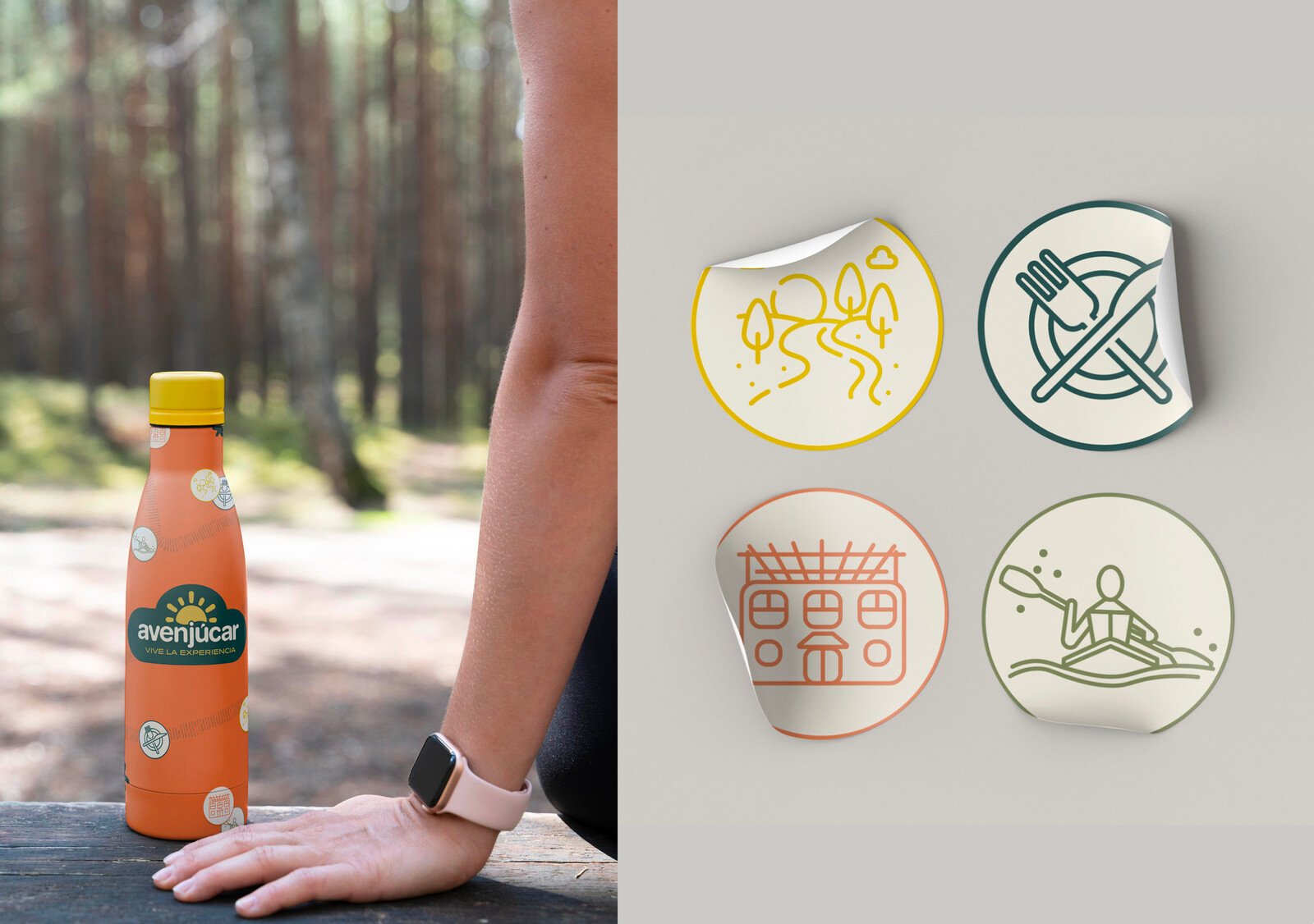
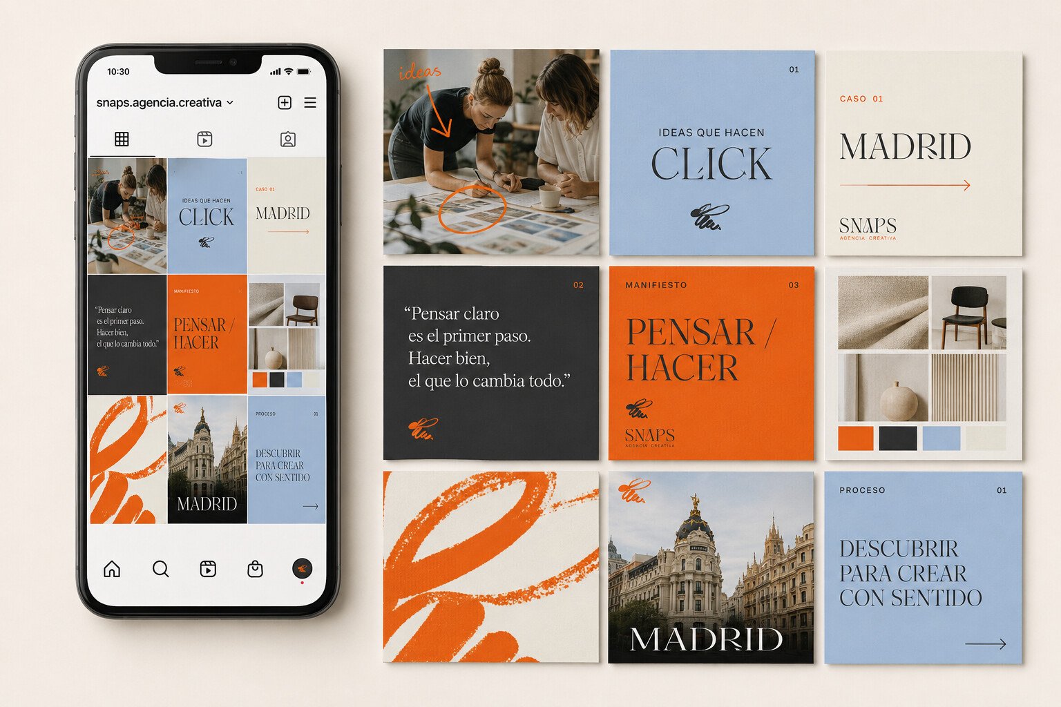
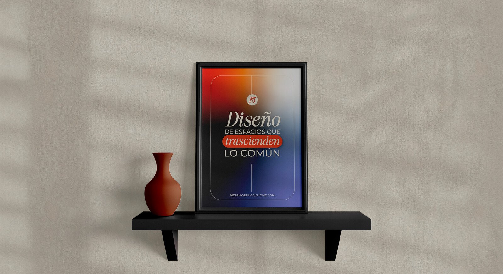
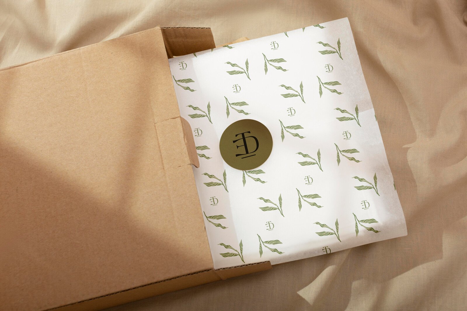
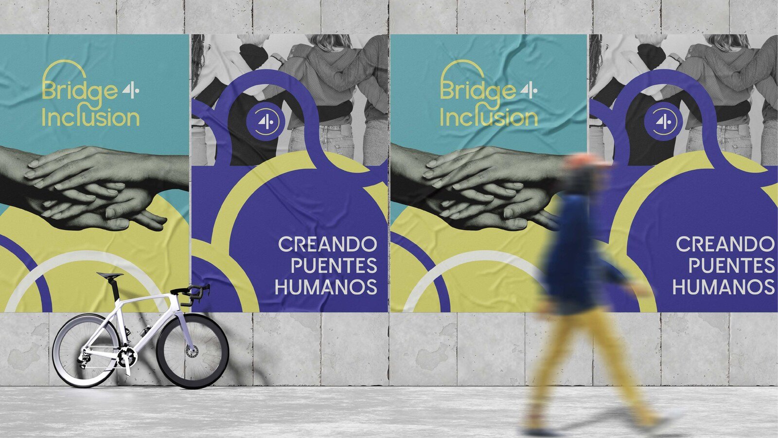
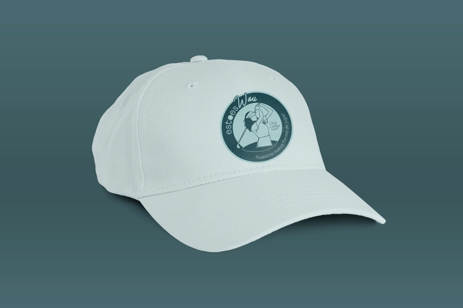
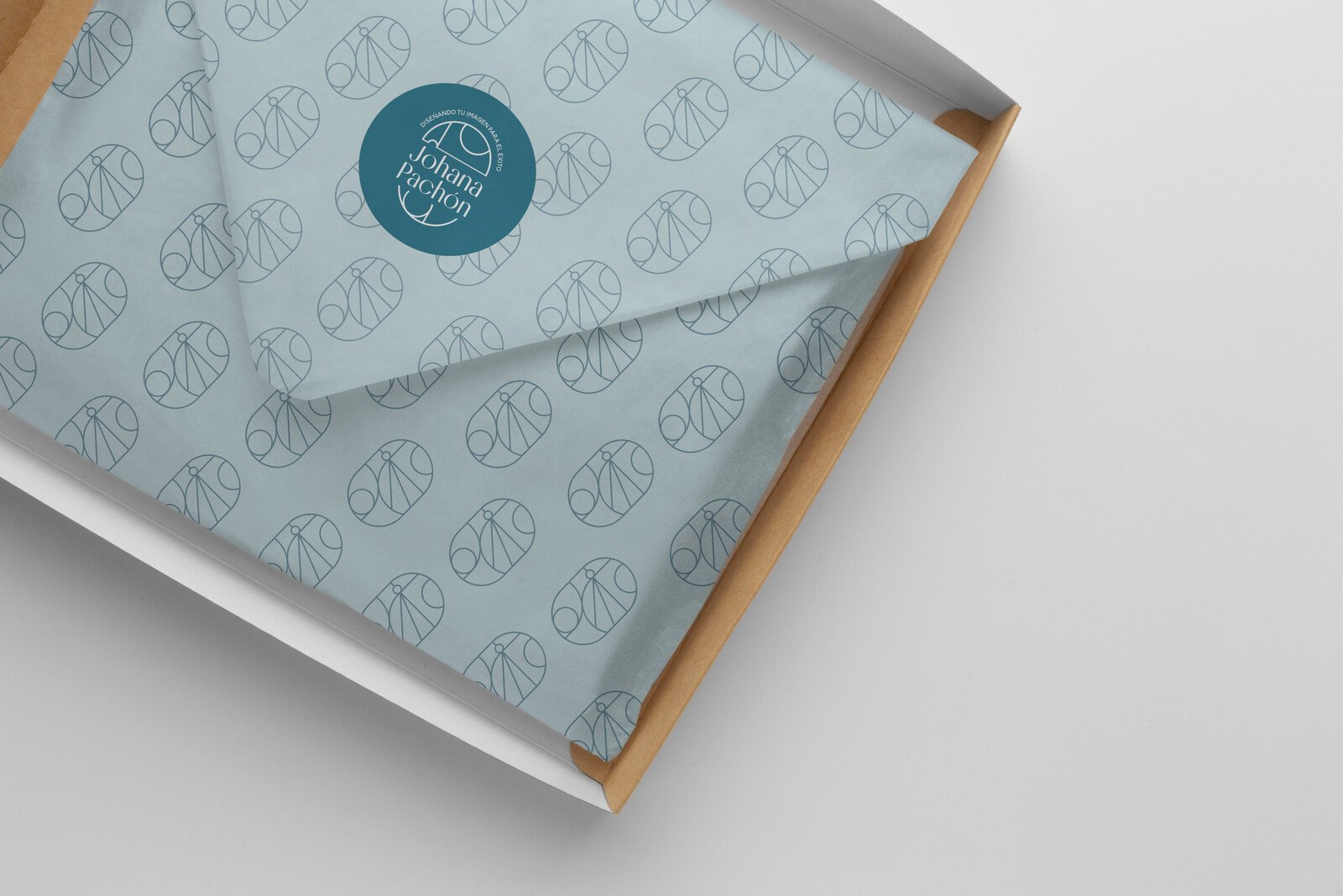
A perfume, an inclusion consultancy, a golf club and an image consultant have nothing in common. The order of the decisions was identical in all four.
What it solves
From noise and loose pieces to system and direction
The DÍVERA method sits behind every one of our services: it’s what makes sure a diagnosis, an identity or a month of content aren’t loose decisions, but steps in the same direction.
- BeforePieces that work on their own and don’t recognize each other, and every visual decision argued from taste, so it gets redone.
- AfterA pattern that orders the color, the tone, the photography and the message, and the judgment to decide what comes in two years without us.